- The Wondrous Agency Newsletter
- Posts
- 7 tips for B2B design that actually converts 💡
7 tips for B2B design that actually converts 💡
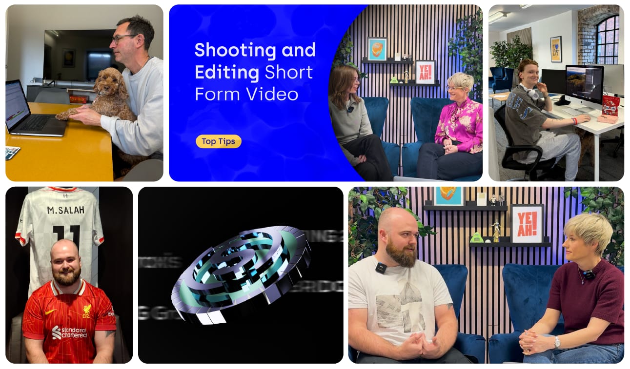
Our new video series exclusive to Wondrous subscribers
Sally Baker
March 06, 2025
Hi there,
I hope that February treated you well and that there’s lots of great opportunities lined up for you this spring. Despite being the shortest month of the year, it certainly packed a punch at Wondrous HQ.
We wrapped up a major client localisation project, brought 3D animations to life in a successful paid campaign, and bid farewell to Sam after his college placement. Outside work, home improvements kept us busy, and Andy managed to snap a pic with a match-worn Mo Salah shirt!
This month I’m thrilled to share our next video series, a new product page and some snippets of BTS at Wondrous.

February highlights at Wondrous
B2B Tech Design That Converts, Not Just Looks Good
Design isn’t just about looking good, it needs to inspire action. And if it doesn’t, then it’s not doing its job.
For fintech marketers, design can be particularly challenging, as you often have to balance complex information with visually engaging elements that are easy for your audience to understand and act upon.
In this month’s video series we explore a few key principles so you can design content that grabs attention, communicates clearly, and drives the action you want.
Check out the full video below.
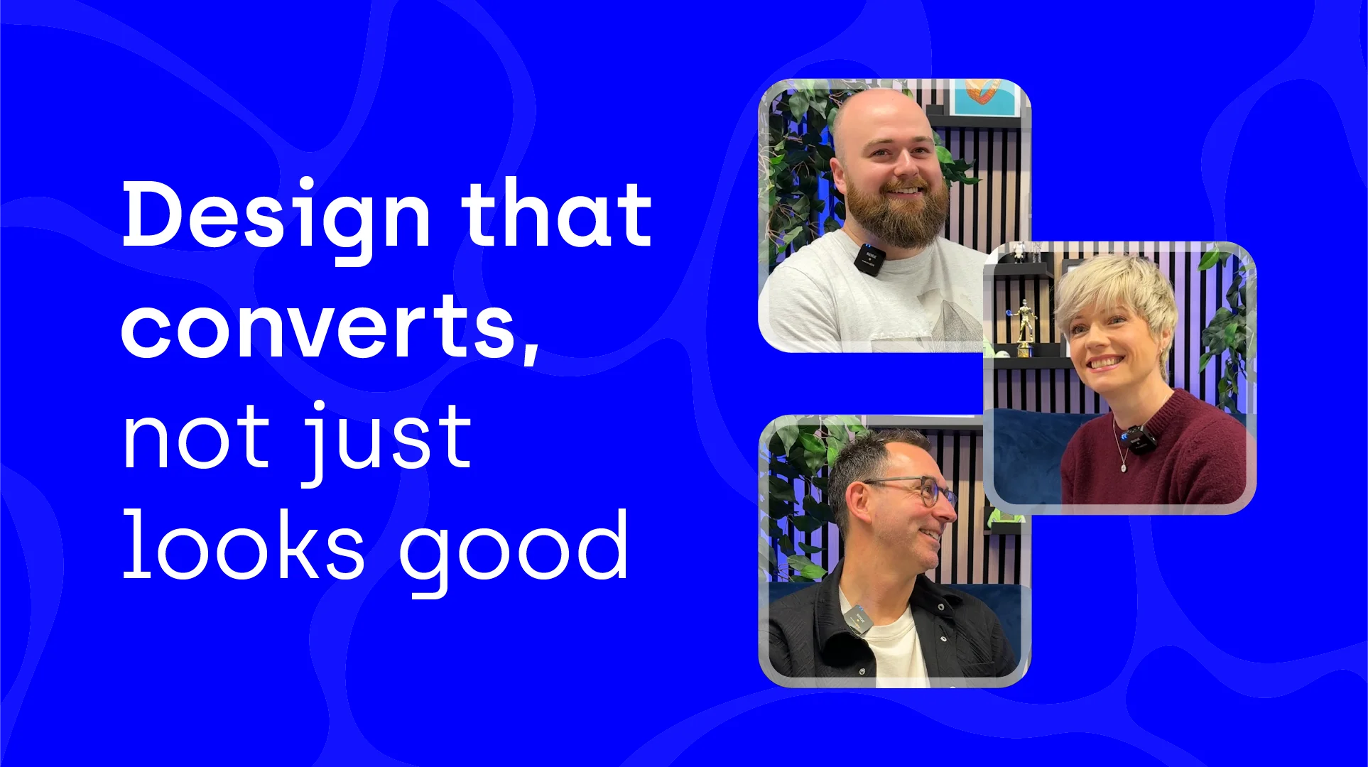
Here’s a short summary of what we covered:
1. Keep it simple
Avoid overcrowding your design with too much content. People in this day and age just want to take in information quickly, so the easier it is for them to digest, the better chance they’ll be able to use that knowledge.
2. The power of hierarchy
Your content should have a visual hierarchy that guides your audience. Ben reiterates how it must lead with impact to grab attention, followed by your message, and then a simple, clear call to action. This order helps ensure they walk away with the most important takeaway.
3. Maintain consistency
If you're designing your own content, always start from the master template to ensure consistency in format, colours, font weights, sizes, and messaging.
Repeatedly copying the last version of a design can cause subtle shifts over time, gradually weakening your brand’s visual consistency.
4. Repurpose content smartly
Andy points out that the fintech sector offers great opportunities for repurposing content, where long-form content such as white papers are frequently published. For example, if you’ve got a 10-page PDF and each page with its own headline, you can turn those headlines into 10 separate social posts.
The trick is to look at each piece of content and think about how you can break it up and use it in different ways to get the most out of it.
5. Tailor content for better engagement
Content can also be repurposed across different verticals, allowing you to not only break down a whitepaper or solution guide into various formats but also adapt it for specific audiences.
This could mean taking a broad approach for an entire sector, such as banks or insurers, or using it in ABM strategies to engage a particular target account.
Typically, this involves crafting a tailored or personalised introduction, incorporating relevant case studies, and customising the CTA to resonate more effectively with each audience.
6. Startups shouldn’t wait for perfection
If you’re a startup or small business, the best time to start creating and sharing content is now, even if it’s not 100% perfect. Focus on getting something out there, then tweak it over time based on feedback and performance.
7. Benefits of outsourcing
Outsourcing your design work to an agency means they take the time to gain a deep understanding of your brand and audience, not just your colours and messaging.
And partnering with one that specialises in your sector means they bring industry insights to help improve performance. Plus, it frees up valuable time to focus on growing your business while experts handle design.
I want these tips to be useful for you - go through the list and pick 2-3 you think will make the biggest impact on your design process, and jot some ideas on how you can put them into action.
BTS at Wondrous
March has got to a flipping good start (sorry! I couldn’t resist) here at Wondrous HQ. It’s always nice to find moments as a team to balance hard work with a bit of fun.
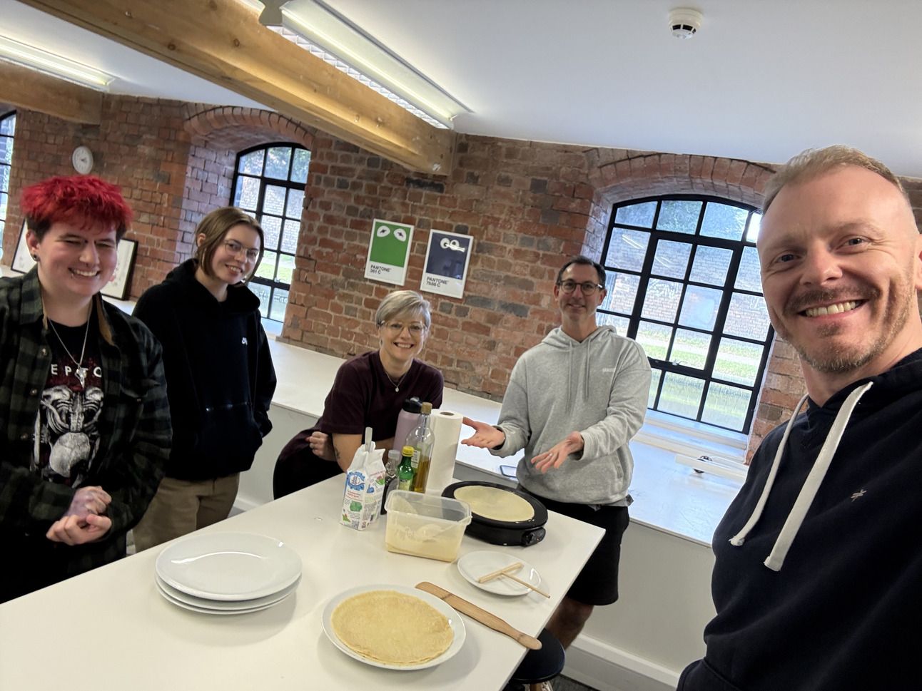
Happy Pancake Day!
New Product Page: Propel Websites
Choosing the right website solution can be overwhelming. That’s why we’ve launched a brand new product page dedicated to breaking down our tailored website solutions, costs, and FAQs, all in one easy-to-navigate location.
Our goal is to help you find a website that not only looks great, but is built to perform, and accurately reflect what your brand stands for.
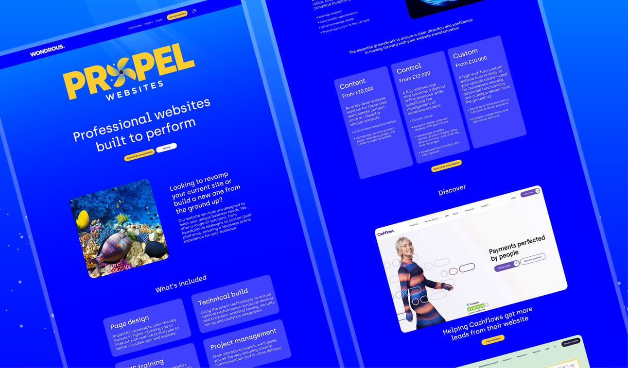
Propel Websites
Book a free 30 min call here to find out more about our tailored website solutions.
Thanks for joining me this month.
Be sure to keep your eyes on your inbox for April’s new video series exclusive to Wondrous subscribers. I’d love to hear your thoughts on our video tips - hit reply for any feedback or suggestions!
Until next time,
Sally